Attractive typography can make or break your design. Fonts play a huge part in delivering the message you’re trying to convey, and if you use the wrong fonts, your message could be ignored, simply because you can’t read it, or even worse, it could be misconceived. You either need to hire a professional designer, or you need to learn your stuff and fast.
If you have a sound understanding of typography principles, you’ll become a master at proper font practices and apply those practices to reel in your customers or audience.
Typeface Anatomy: 5 Styles You Need To Know
There are several different styles of typefaces. This is called “Typeface Anatomy” or “the graphic elements that make up letters in a typeface.”
Serif Typefaces
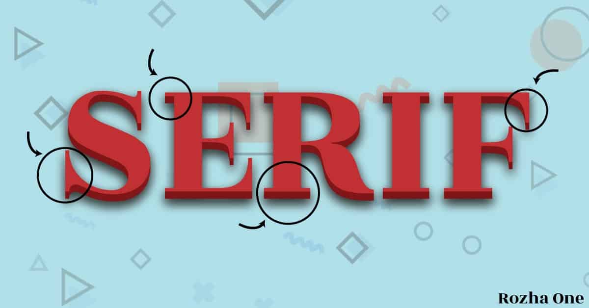
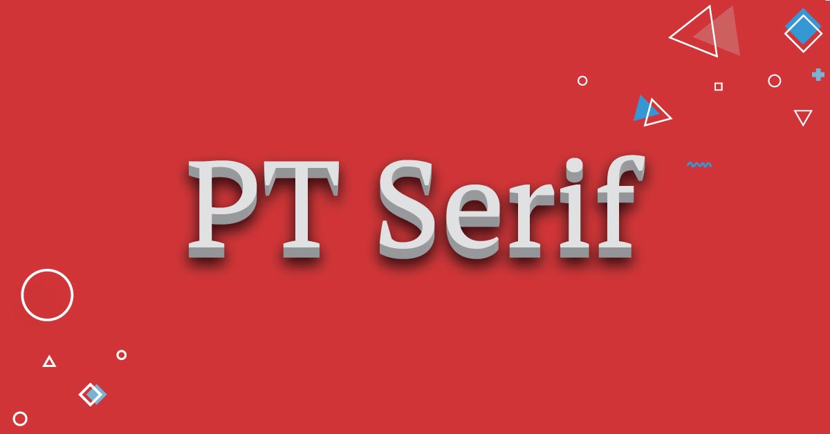
In Typography, you’ll often hear people refer to a font with extra lines coming off the longer strokes, as Serif fonts. Merriam-Webster defines Serif as “any of the short lines stemming from and at an angle to the upper and lower ends of the strokes of a letter.” You’ll notice that when you look at any font categorized as Serif, they’ll have extra strokes or tails at the end of the letters.
Serif fonts are best used as headings, or with large fonts, as the smaller the font, the harder to read. A serif font is usually paired with a sans-serif font as the paragraph font. This creates a pleasant contrast.
5 Excellent Serif Web Fonts
You want to try to go with a web font anytime you can so you get the most compatibility.
Sans-Serif Typefaces
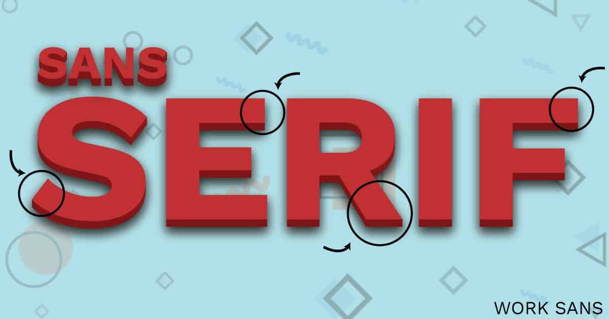
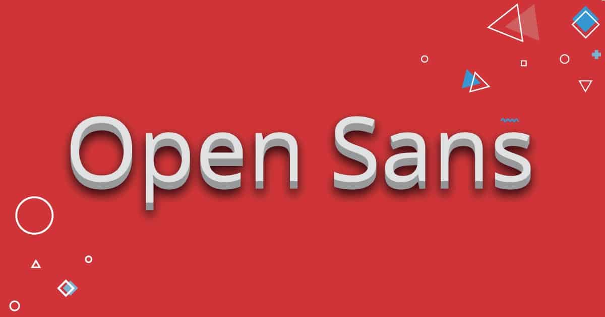
In contrast to Serif, Sans-Serif does not have extra lines or tails coming off the letters’ longer strokes. The word “Sans” in Sans-serif comes from French roots, meaning “without”. This is an easy way to remember the difference between the two!
Sans-Serif fonts are very versatile and can be used in headings or paragraphs, large or small. Sans-Serif fonts can be paired with a Serif or Sans-Serif heading.
A great tip to add some contrast between two Sans-Serif fonts is to use a bold font and a light font together. You would use a bold sans-serif font for the heading (avoid bold fonts for large paragraphs as this can cut down readability) and a lighter font for the paragraph font.
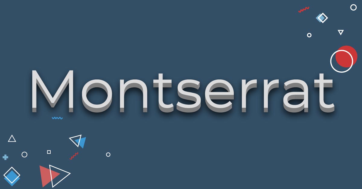
5 Exceptional Sans-Serif Web Fonts
Here are some awesome sans-serif web fonts to use in your projects.
Monospace Typefaces
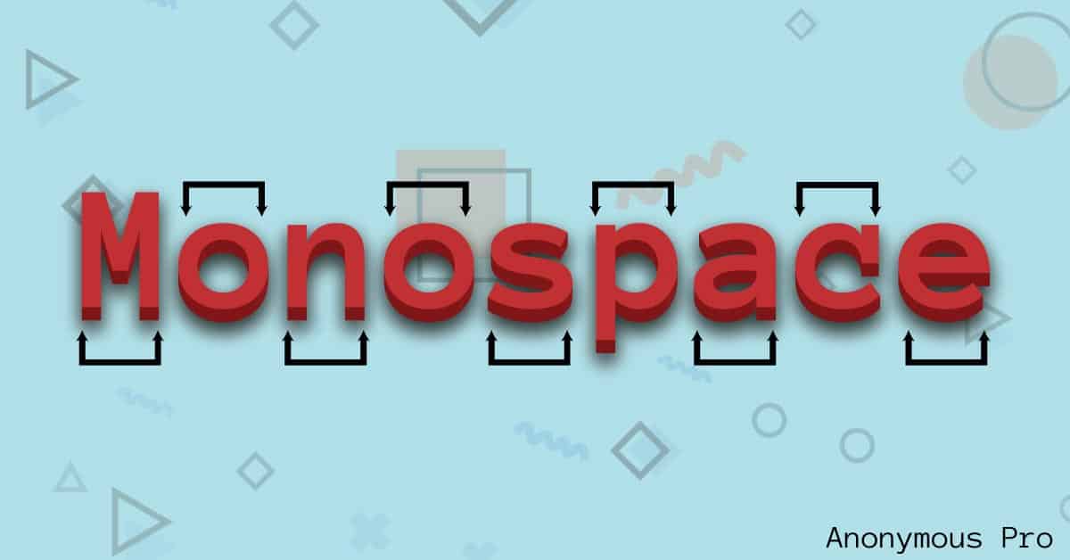
Another typical typeface style is “monospace” or a monospaced font. A Monospace typeface is a font with letters and characters that fill an equal amount of horizontal space. These fonts have characters that are fixed-width, contrary to proportional typefaces such as Serif or sans-serif.
Most people find non-proportional typefaces such as monospaced fonts more challenging to read, so you’ll discover proportional typefaces more commonly in design projects. However, typewriters and old computers used fixed-width fonts only.
If you decide to use a monospaced font, use it sparingly. A prominent place to use it for would be a blockquote to create an old typed letter feeling, but make sure the font isn’t too small or hard to read. Trial and error is the best way to decide what looks better.
5 Formidable Monospace Web Fonts
Here are some monospaced web fonts you can work with.
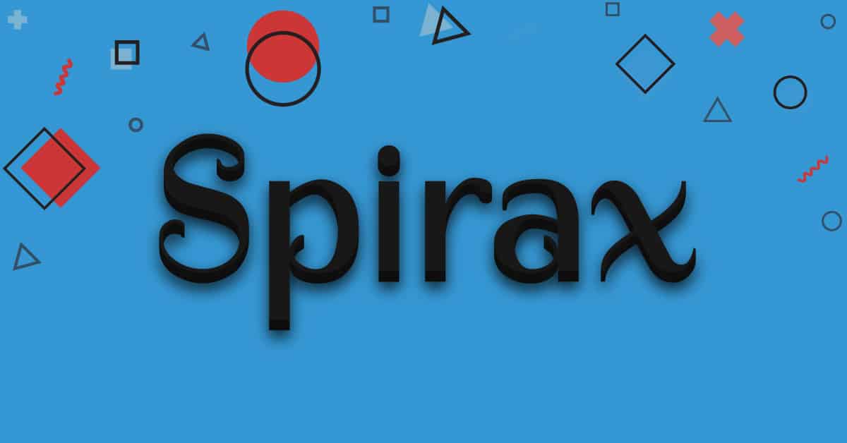
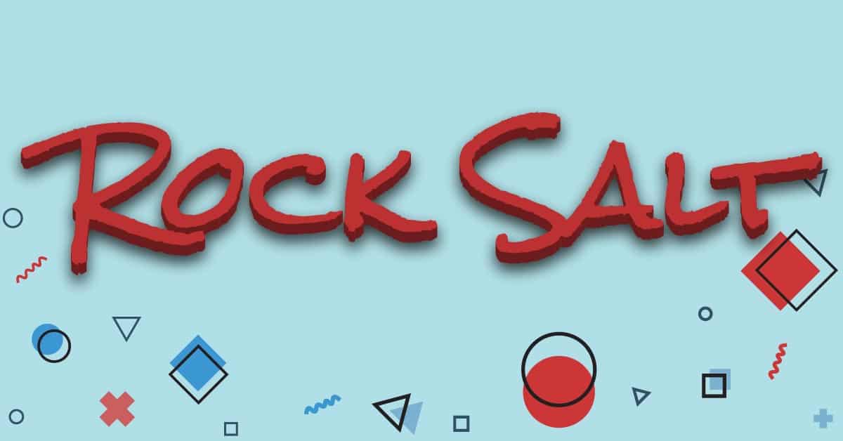
Display Typefaces

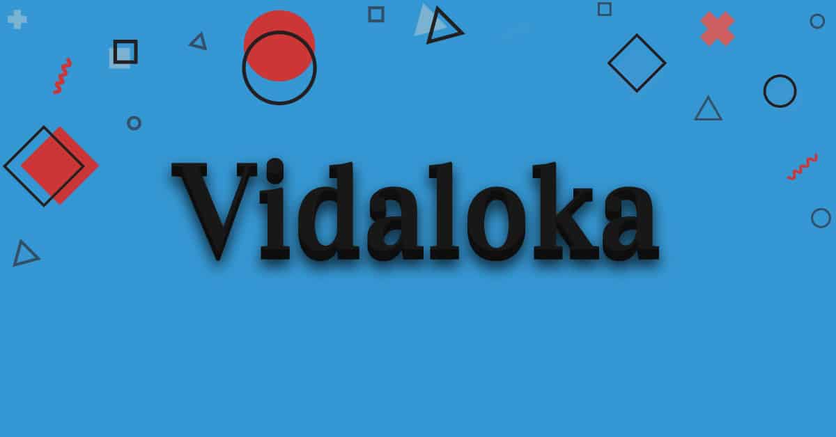
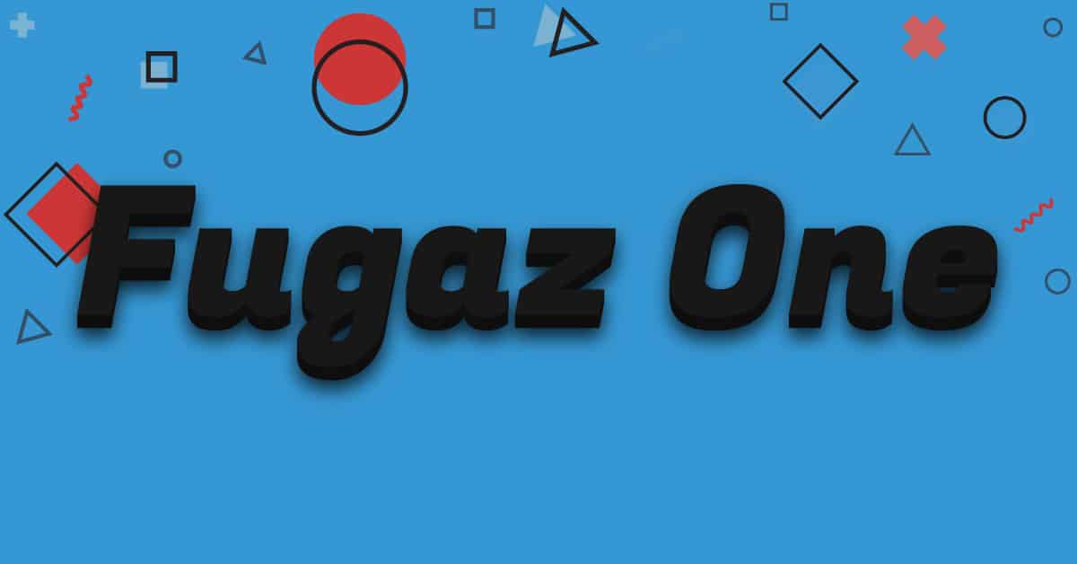
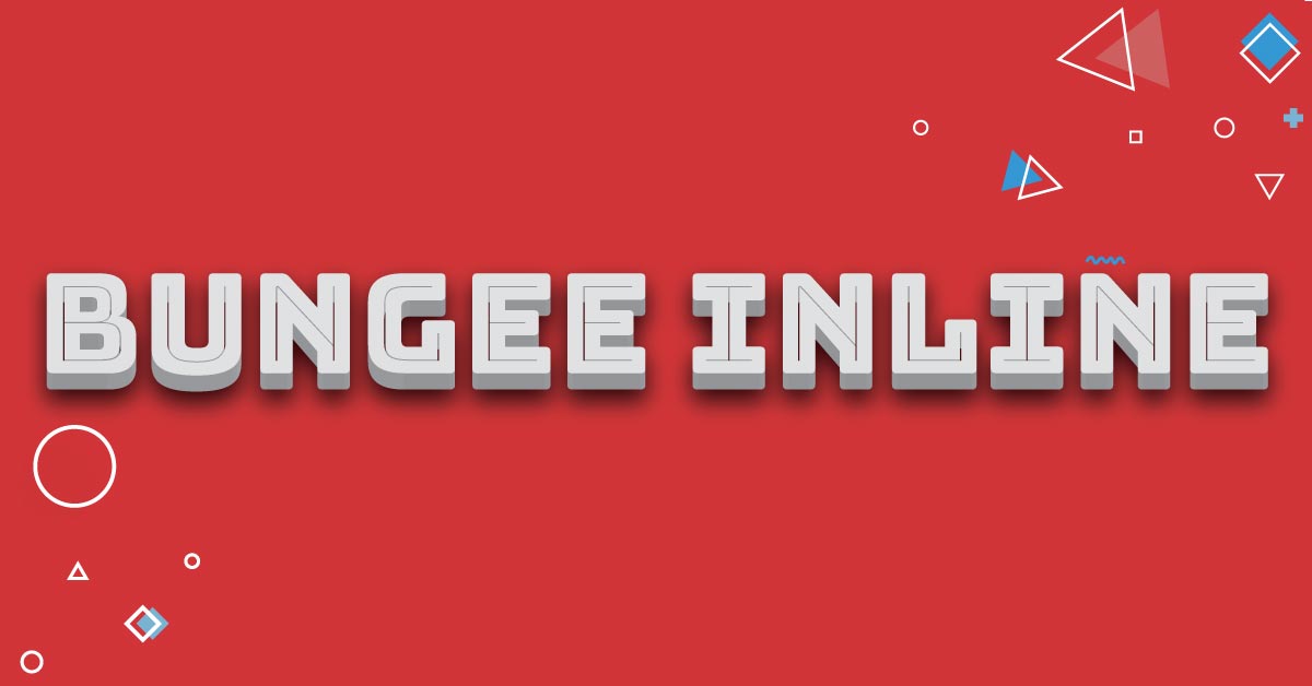
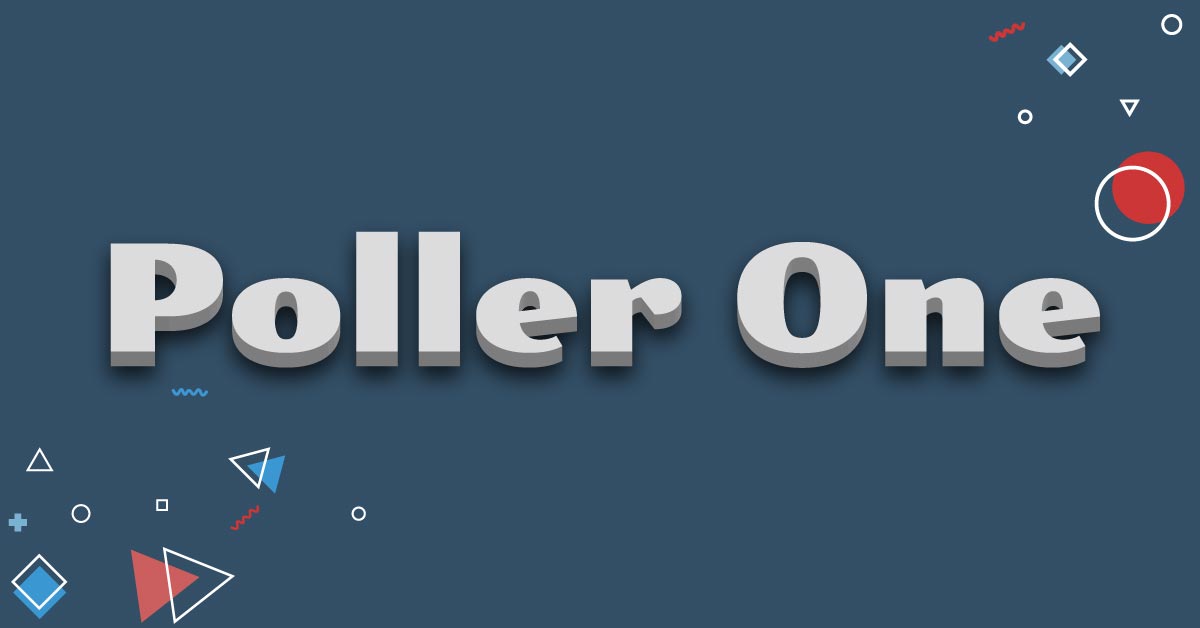
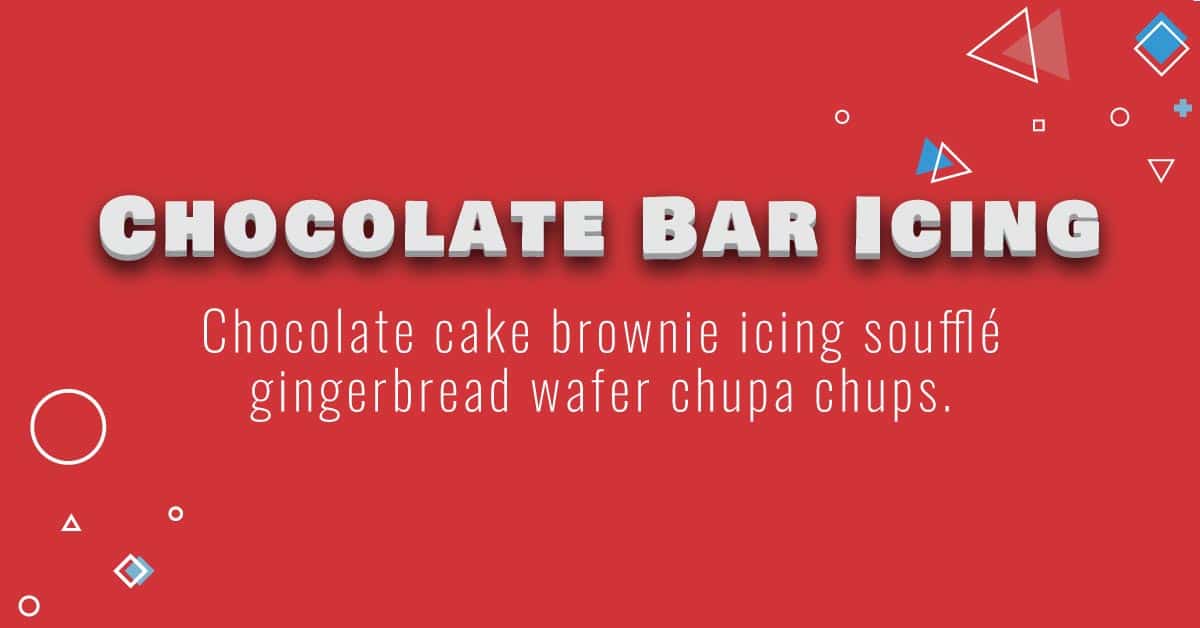
A “Display” font or typeface is used to be bold and to make a statement. You’ll see display fonts used solely in big headings or text.
Display typefaces are usually extremely hard to read as a paragraph font or with small text. A huge rule of thumb in design is legibility. You want to make sure your audience or customers can actually read the message you’re trying to convey, so avoid using display typefaces where they don’t look right.
They should be used minimally to make a lasting impression, and when done correctly, can be a great marketing tool.
5 Stunning Display Web Fonts
Here are some strong display web fonts you can use to add some oomph to your projects.
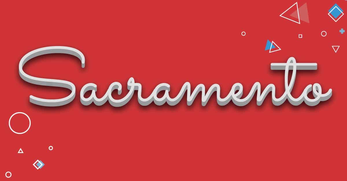
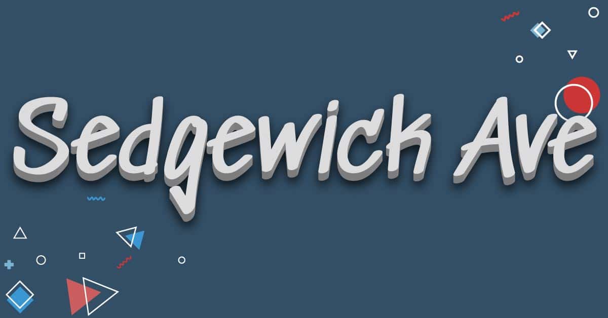
Script Typefaces
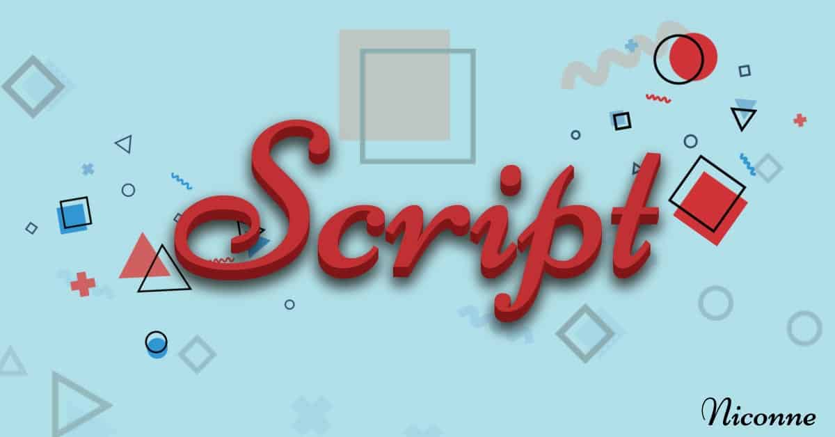
A “Script” font or typeface is generally cursive or made to look like someone’s handwriting. Script fonts are great for evoking a feel of luxury, establishing trust, or adding a “personal” or human element to your site.
Still, some script fonts are incredibly hard to read and can have the opposite effect if misused. Script fonts should be considered for the same level of use as a display font, to be bold, or to make an impact. Less is more with typeface styles such as this.
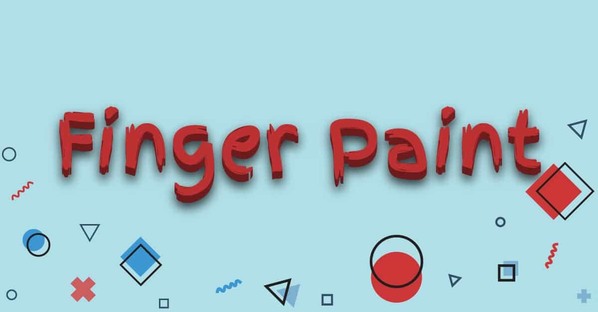
5 Beautiful Script Web Fonts
Here are some admirable script web fonts you can use to make your headings stand out.
Go Big Or Go Home
I don’t know about you, but I’m absolutely BLIND. It is one of my biggest pet peeves, along with many other people, when I see tiny, illegible text. You don’t want your audience to have to get their reading glasses.
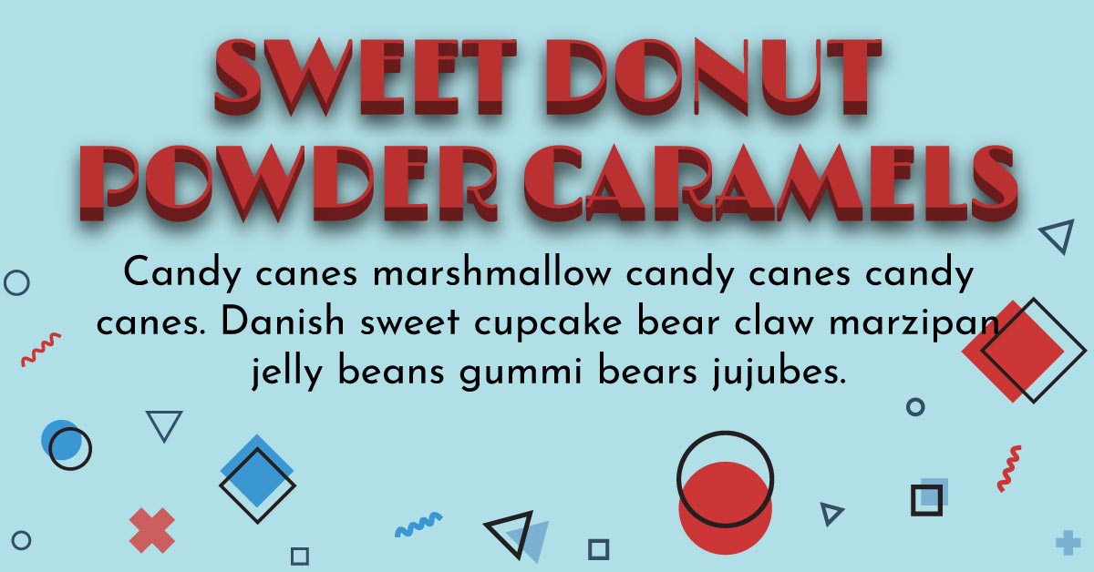
Take a look at some of these examples that show how font size can destroy an otherwise perfectly attractive font.
Bad Font Sizing
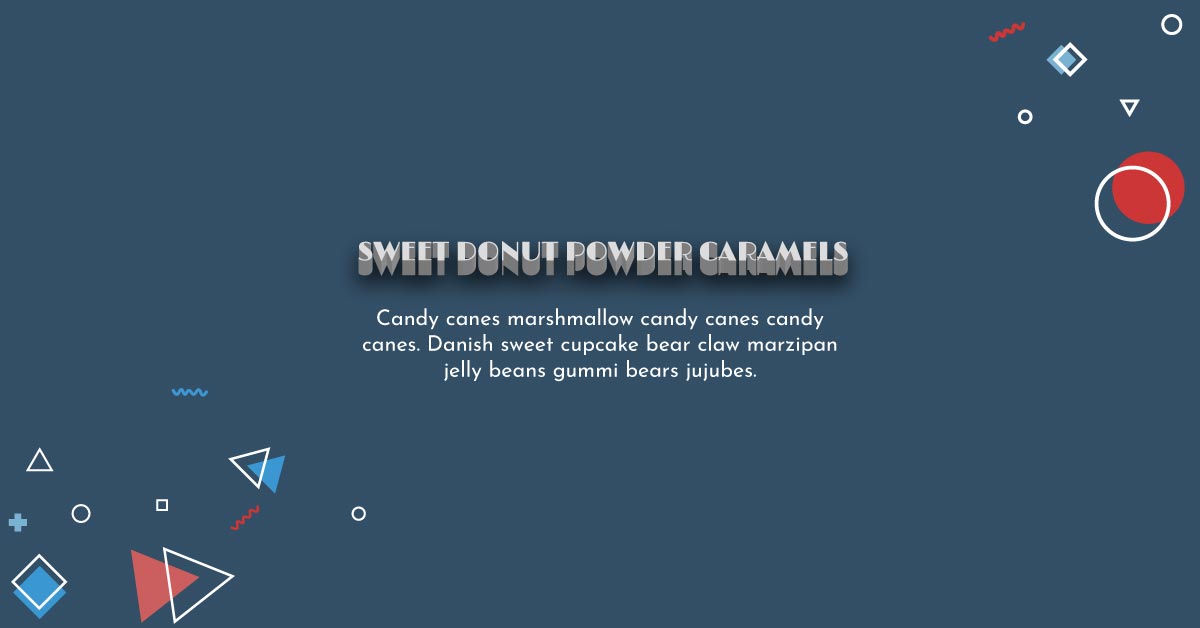
Good Font Sizing
Letter-spacing & Line-height
Another few typography elements that can make or break the legibility of a font are letter-spacing and line-height.
Some fonts by default have poor tracking (space between lettings), and this can cause a font that would be otherwise very readable to look bad at specific sizes, and maybe even all sizes. Luckily, you can adjust letter-spacing on any font, whether within the CSS (which a great developer such as yours truly can help you with!) or within your project elsewhere.
Here are some examples of fonts before and after playing with the line-height and letter-spacing.
Bad letter-spacing & line-height
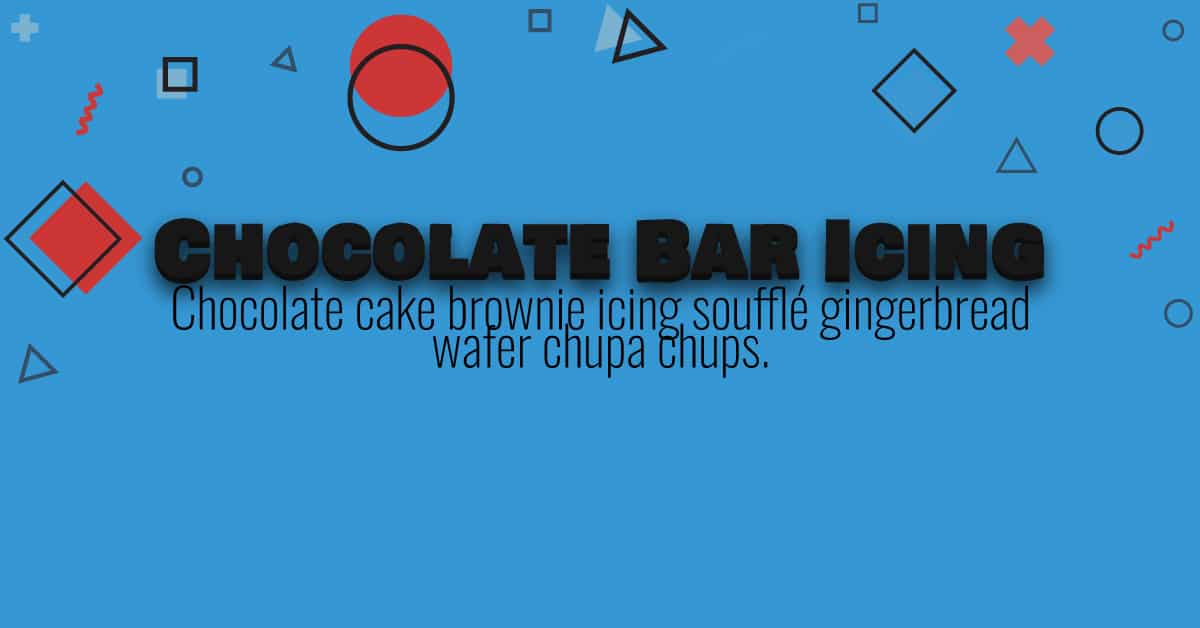
Good letter-spacing & line-height
Match Your Font To Your Message
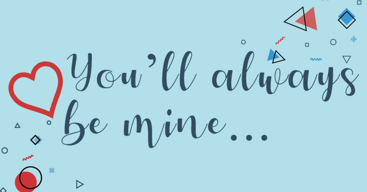
If you were writing a beautiful love letter, would you use a lovely handwritten font, as if the message were written by prince-charming himself?
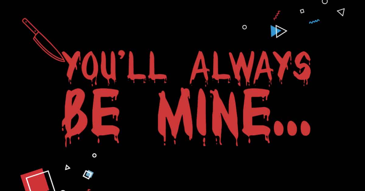
Orrrrrrrr… would you use a bloody, scary-looking font, as if the letter were written by Michael Myers? Halloween may be coming up… but you’re definitely not trying to scare your lover away.
If you don’t know what I mean, take this, for example.
Bad Message Matching
Good Message Matching
Legibility Is The Most IMPORTANT Rule of all!
You ALWAYS and I repeat, ALWAYS need to make sure the font is readable. Letter-spacing, line-spacing, typeface anatomy, and color contrast all play a considerable role in that.
Rules to absolutely follow:
- If your font is too small, make it bigger.
- Does your font look like it’s too thin? Make it bolder or adjust the font-weight higher.
- Are you using bright yellow on a white background? NO! Absolutely not. Rethink your color choices. Always use a light color on dark backgrounds or dark colors on light backgrounds.
- Do your font letters look squished? Adjust the letter-spacing.
- If your lines are too close together, adjust the line-spacing.
Whatever you do, make sure your fonts POP! If you follow these rules, you should be golden. If you’re ever unsure, you can always ask a professional designer!
Browser friendly typefaces
There are several different formats that typefaces come in. Some are more compatible in several different browsers than others, so you’ll want to keep that in mind when you pick a font. If you choose a web font, that’s usually your safest bet.
- TTF (TrueType Font)
- WOFF (Web Open Font Format) and WOFF2
- EOT (Embedded OpenType)
- OTF (OpenType)
- SVG (Scalable Vector Graphics)
TTF and WOFF are the most compatible so try to stick to those.
Websites To Find Impressive Fonts
These are my favorite sites to get great fonts from. They all have their own pros and a wide variety of fonts to pick from.
Google Fonts
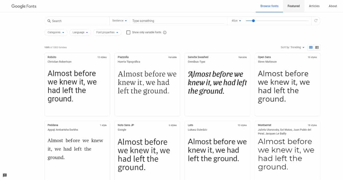
Google fonts is excellent for pretty much any type of project ranging from web design to print design. Google Fonts offers several different ways to integrate their web fonts into your online projects. They also offer a pairing guide for what fonts make look good together and let you try several different combos together before you download. You can type a sentence and see that in several different fonts, so you have the opportunity to make the best decision.
DaFont
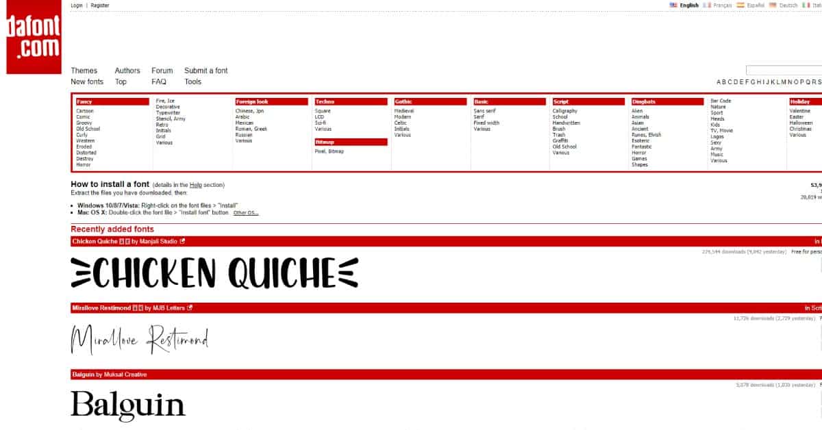
DaFont has tons free of display fonts, script fonts, and other fonts for free commercial and personal use. Dafont is excellent for projects involving making visual ads for social media or print design. You can find pretty much anything, but web fonts (unless you convert to Webfont!) Make sure to check the licenses when picking. If you’re using for commercial and don’t want to buy a license, make sure it says it’s for “100% free” use. If you’re using for personal use, you can make sure it says “for personal use.”
Adobe Fonts (formerly Adobe Typekit)
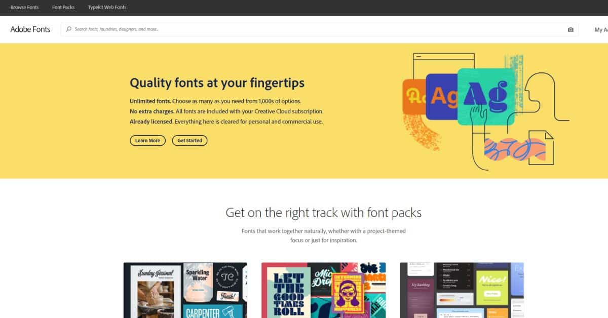
For people with adobe subscriptions, Adobe Fonts is great as adobe has many fonts available that aren’t anywhere else without paying. You can also load fonts directly into your projects!
Font Squirrel
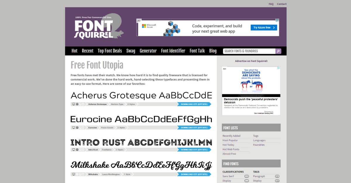
Font Squirrel is great for finding unique fonts with the qualities you want quickly. You can filter by several different tags, such as retro, geometric, hand-drawn, minimal, and more. This offers the opportunity to pick a font by the feeling you are trying to evoke. You can generate your own web fonts for the highest compatibility for multiple browsers. Font squirrel makes it easy to tell which fonts are free and which fonts are almost free. Another point is that it has a font identifier if you ever like a font in a picture and you’re not sure what it is.
Fonts to avoid from a design standpoint
Okay, so it’s not that you NEVER should use these… because they’re the most commonly supported by browsers, but from a designer point of view, these are terrible and make you look like you don’t care about making things look aesthetic. These should only ever be used as fallback fonts or NEVER.
Arial
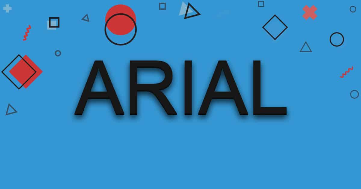
This is literally the most basic font ever, used by EVERYONE ever, and makes you look like you’re barely even trying.
Times New Roman
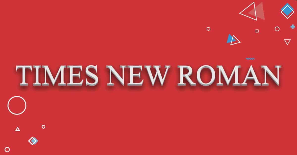
We were forced to use this for every typed essay we ever wrote. Why on earth would we still want to make ourselves to use it to actually make stuff look good? This is another basic font that comes with Windows that just makes you look too lazy to find another one to use.
Comic Sans
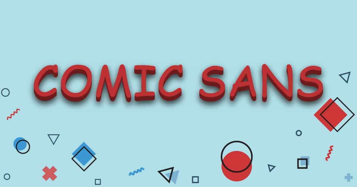
If I had to pick the perfect font that captures the vision of a pack of five-year-olds at a birthday party scribbling on the walls with crayons, it would be Comic Sans. Enough said.
Papyrus
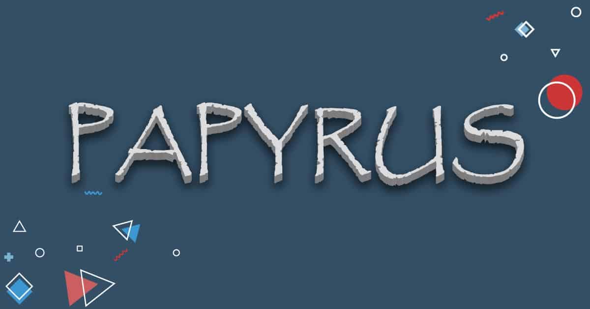
Papyrus looks early 2000s hot garbage. The spacing is uneven, it’s “dirty” looking, it looks terrible, and it’s waaaay overused in advertisements, billboards, and books. I’m sure you recognize it without even realizing you’ve seen it before. That is not necessarily a great thing if you’re trying to stand out.
Curlz MT
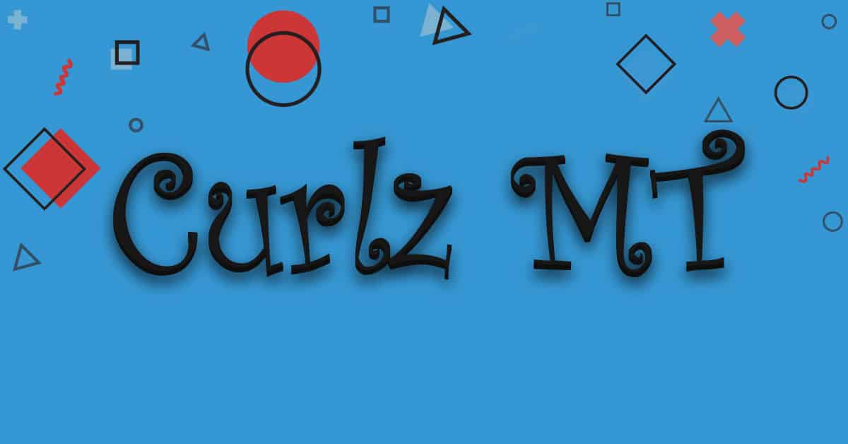
Oh, Curlz MT… the font I thought was so cool when I was eight-years-old to put in the 3d rainbow font in the old Microsoft word. When I showed everyone, they would smile and encourage me, but it was clear they were saying “EWWW” on the inside. In other words, if you’re trying to do any sort of adult business, definitely don’t use this.
So Now That You’re A Typography Master…
Run free and make some beautiful things with your new typography skills! If you’re still lost about what to do or need ideas, make sure you subscribe to my newsletter for tips, tutorials, and other freebies (such as the free brainstorming worksheet you get when you sign up!). Of course, I am always here to help you out if you need some gorgeous typography for your project ASAP.


